Mobile landing page design: keep the offer, rethink the space
Plan a landing page that stays readable and usable on a phone, from image crops and content order to buttons, overlays, and the on-screen keyboard.
Keep the visitor’s task in view
A mobile landing page needs the same offer and facts as its desktop version. The space, reading order, and controls need their own review. Shrinking everything until it fits can leave the visitor with tiny type, cropped information, and several screens of decoration before the page explains what to do.
Write the first-screen priorities before moving elements around: the business or product, the offer, and the next step. A restaurant visitor may need to see the menu; a service inquiry may need a location check. Keep those priorities visible as you decide which image crop to use and where supporting details should follow. You can shorten repetition without hiding information that affects the decision.
Dense visuals need another way to read them
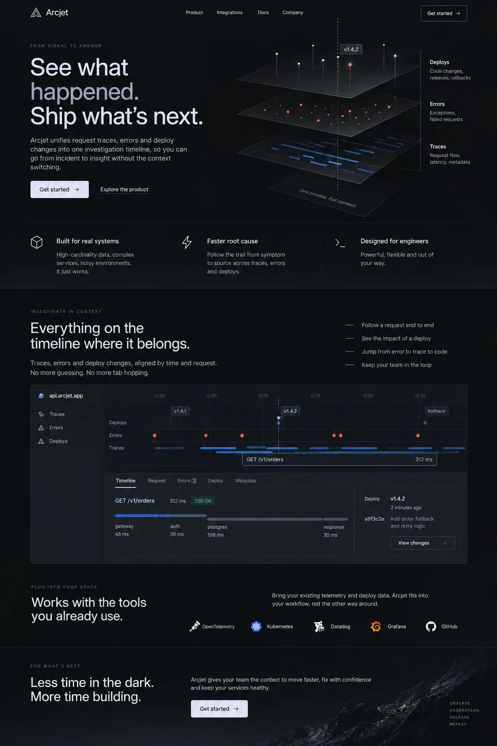
Arcjet’s desktop concept combines a large headline with a layered diagram of traces, errors, and deployments. Farther down, a wide interface illustration shows those events on a timeline. Both help explain the intended product, but their small labels would be difficult to read if the whole composition were simply reduced to phone width.
For a working mobile page, we would put the short explanation before the diagram and repeat the essential relationships in text. A visitor could then open the detailed illustration at a larger size if needed. Cropping out the labels might preserve the mood while losing the explanation. Decide which job each visual performs before choosing how it scales.
Check reading order, zoom, and horizontal scrolling
A two-column section often becomes one column on a phone. Read the result in order: a heading should stay with its explanation, a price with its conditions, and a photograph with its caption. Check the document order as well as the visual placement so keyboard and screen-reader users encounter the same sequence.
WCAG’s Reflow criterion uses a width equivalent to 320 CSS pixels for vertically scrolling content, with exceptions for content that needs a two-dimensional layout. Most landing-page prose should fit without side-to-side scrolling. Check that narrow view and enlarged text, then investigate any clipped line, wide card, or control that pushes the page sideways.
Source: W3C Web Accessibility Initiative: Understanding Reflow
Give controls enough room to select
Small icon buttons and tightly packed links are easy to overlook during a desktop review. Try the menu, close button, variant choices, and form controls on a phone. Leave enough separation that selecting one action does not accidentally trigger its neighbor. A large visible icon helps only if the clickable area is large too.
WCAG 2.2’s minimum target-size criterion generally uses 24 by 24 CSS pixels, with defined exceptions including spacing and inline links. Treat that as a minimum requirement with conditions, not a universal ideal button size. A primary action can comfortably be larger. Check the actual target bounds and the space around them rather than judging the icon alone.
Source: W3C Web Accessibility Initiative: Understanding Target Size (Minimum)
Open the menu, keyboard, and banners together
A sticky action bar can seem convenient until the keyboard opens and only a few lines of the form remain visible. Test that state deliberately. Add any cookie banner, chat control, or navigation overlay that a visitor can encounter. Check whether the field being edited, its error message, and the next action can still be reached.
W3C’s focus guidance requires that an element receiving keyboard focus is not entirely hidden by content the page author created. For a landing page, removing an unnecessary sticky element may be simpler than adding another way to dismiss it. Keep the visitor’s place when overlays close, and avoid a menu that traps them away from the page.
Source: W3C Web Accessibility Initiative: Understanding Focus Not Obscured (Minimum)
Review loading and movement on the actual page
Use appropriately sized image files, reserve their layout space, and keep optional media from delaying the offer. Then inspect the published address on an ordinary connection. Watch what happens before everything has loaded: whether the headline appears, whether controls respond, and whether the action moves just as someone tries to tap it.
Core Web Vitals cover loading, responsiveness, and visual stability. Use their measurements to investigate specific problems, alongside your own task review. Finish by completing the intended action, returning to the page, and checking the result with larger text. Record the device and the problem so the next revision can be reviewed against the same conditions.
Source: web.dev: Web Vitals
Sources and further reading
- Understanding ReflowW3C Web Accessibility Initiative
- Understanding Target Size (Minimum)W3C Web Accessibility Initiative
- Understanding Focus Not Obscured (Minimum)W3C Web Accessibility Initiative
- Web Vitalsweb.dev