Restaurant landing page examples: food, menus, and reservations
Explore restaurant website designs, with ideas for food photography, menus, location details, and reservations.
Show the food and explain how to visit
A restaurant landing page has two connected jobs: help a guest picture the experience and give them enough information to plan it. Food photography can establish interest quickly. Menu, location, hours, and a clear reservation or ordering action turn that interest into a possible visit.
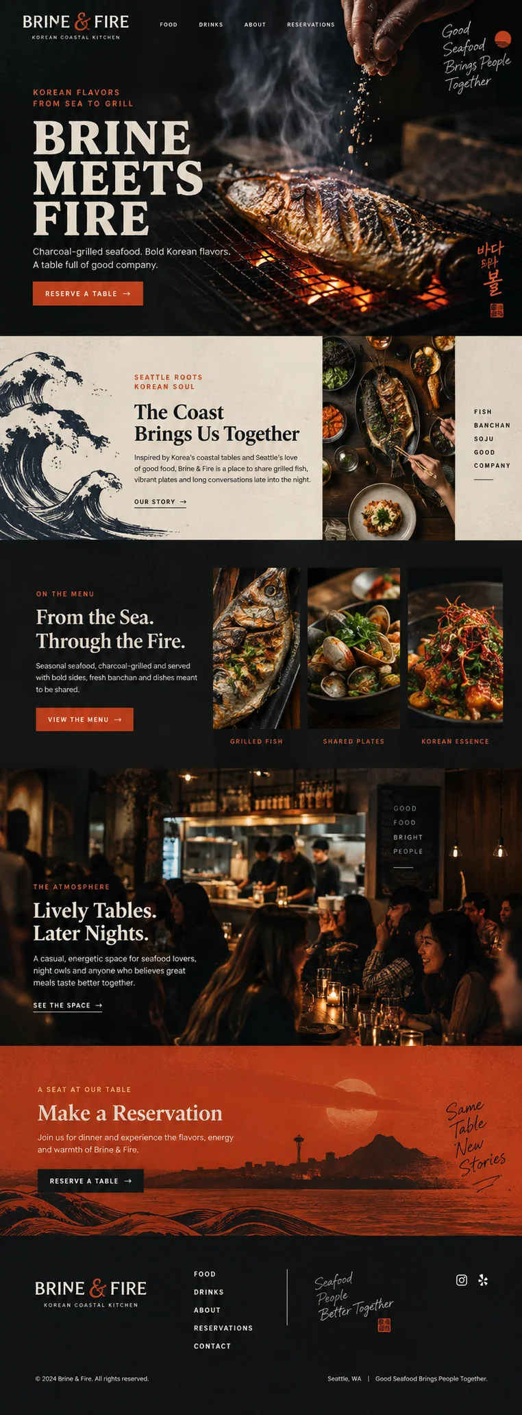
The Brine & Fire design was created with Waveform for a Korean coastal kitchen brief. Its grilled seafood and dining-room imagery give us specific choices to examine.
Brine & Fire: lead with the food
The opening photograph shows a whole fish over a charcoal grill, with seasoning falling into the frame. Dark backgrounds, warm accents, and large type continue through the page. The first action invites a reservation; the following sections introduce shared plates, the menu, and the room. The imagery supports a particular meal rather than a generic claim about unforgettable dining.
The menu section uses three food images to give the restaurant’s range some shape. The atmosphere section then answers a different question: what might an evening here feel like? That order is worth considering when food is the main reason someone will visit. It is less suited to a campaign whose specific promise is private dining, an event, or a lunchtime special. Those visits need their own details nearer the top.
The missing details belong in the design brief
The concept names Seattle, but it does not visibly provide a full street address, operating hours, or menu prices. These are material gaps for a real launch. A guest needs to judge the journey, timing, and likely cost before they can make a sensible reservation. Add the information in readable text and make the menu easy to open on a phone.
A menu PDF can be a useful download, but it should not be the only way to learn what is served. Keep the current menu available in a readable page, identify dated or seasonal information, and remove expired offers. If the kitchen can answer dietary questions, provide the actual contact route. Do not imply that a dish is suitable for someone’s allergy without a verified basis.
- The restaurant’s real address, directions, and contact details.
- Service hours, including differences between lunch, dinner, and the bar.
- A current menu with prices and enough context to understand the dishes.
- Reservation, walk-in, ordering, and group-booking information that reflects the operation.
Test what happens after clicking Reserve
Keep the action aligned with what happens next. If the button opens a booking provider, confirm that it reaches the correct restaurant and location. If it sends an inquiry, label it as a request and explain when the guest can expect a response. A submitted message is not a confirmed table.
Try the journey with the restaurant’s actual setup: selecting a date and party size, finding no availability, changing the choice, and returning to the menu. Use a test or non-submitting path when you are reviewing it. On mobile, watch for a booking overlay that hides its close control or makes the menu difficult to return to. Guests should be able to complete the booking and return to the restaurant information when they need it.
Tidehouse shows where a quieter approach can fit
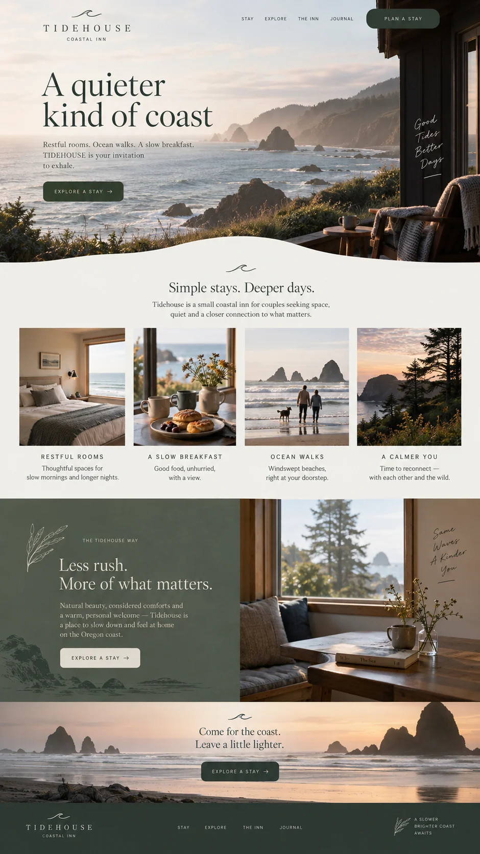
Tidehouse uses pale backgrounds, coastal views, and a slower visual pace. Its breakfast imagery sits alongside rooms and walks, making food part of a longer stay. Brine & Fire makes the meal itself the main event. Neither direction is a universal hospitality style; each responds to the type of experience the brief describes.
For a restaurant, choose photographs that help people recognize what you actually serve and the space they will enter. Use accurate captions and image alternatives where they convey information. W3C’s guidance distinguishes informative images from decoration; a menu rendered entirely as an image needs a more usable equivalent than a generic description of the picture.
Source: W3C Web Accessibility Initiative: Developing for web accessibility
Keep the website and local business information consistent
For an actual restaurant, keep the name, address, hours, phone number, and menu destination consistent across the site and the business profiles you manage. Google’s LocalBusiness documentation includes restaurant details such as cuisine, menu URL, and opening hours. Keep structured data consistent with the details guests can read on the page.
Give someone responsibility for updates when hours or menus change. Before publishing a campaign for a special evening, confirm the date, price, capacity, and booking conditions with the people running it. Check that the published page matches those details and that the booking destination accepts the right requests.
Source: Google Search Central: Local business structured data
Sources and further reading
- Local business structured dataGoogle Search Central
- Developing for web accessibilityW3C Web Accessibility Initiative