Landing page examples: a closer look at four designs
A close look at four landing page designs, from candy to local services. See how imagery, information, and the next step work together.
What does each page help visitors do?
A useful landing page example shows you how a business helps someone decide. Look beyond whether you like the colors. Identify the offer, the intended visitor, the question the page answers first, and the action it asks for. A beautiful page can still leave a visitor wondering what is being sold or whether it is available to them.
These four Waveform designs show how different briefs shape a page. Each offers ideas you can apply to a campaign page or homepage. In the advertising sense, Google calls the page reached after an ad click a landing page, whatever its position in the site.
Source: Google Ads Help: Landing page
Pepple: let the product do some of the explaining
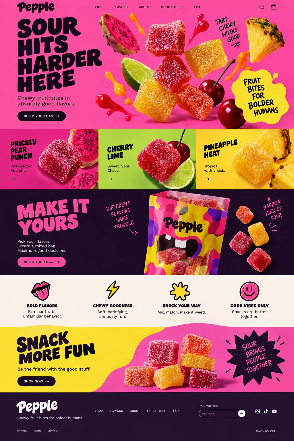
Pepple uses saturated pink and yellow, oversized lettering, and close views of candy and fruit. The visual treatment communicates a sharp, playful snack before the reader gets through the introduction. Below the opening section, three flavor tiles turn that impression into a choice. The mixed-bag section then gives those choices a purpose.
The bag-building action repeats after the flavor choices and again near the end, giving readers another chance to act as they browse. A real candy campaign would still need pack sizes, current prices, ingredient and allergen information, and delivery terms close enough to inform the purchase. Borrow the sequence from appetite to options to purchase, then supply the details that the visual leaves open.
Patchwork Electric: name the service and the place
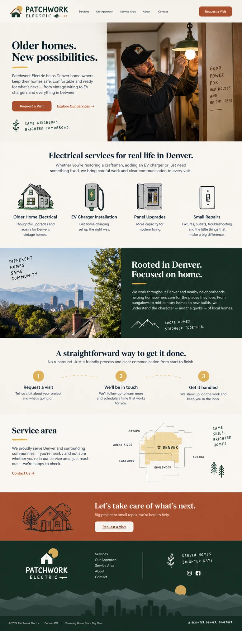
Patchwork Electric names a place and a type of home. Its opening shows an electrician at work, while the next section separates older-home electrical work, EV charger installation, panel upgrades, and small repairs. The service-area map appears later. Each part reduces a different uncertainty: what the business does, whether it understands the job, and whether it serves the visitor.
For a campaign about one service, we would bring that service forward and keep the other work in supporting navigation. The request-a-visit sequence tells visitors someone will follow up before work happens. A real business should be equally precise about appointment availability and response expectations. Use verified licenses or qualifications where relevant; decorative badges cannot substitute for evidence.
Tidehouse: connect the setting to the stay
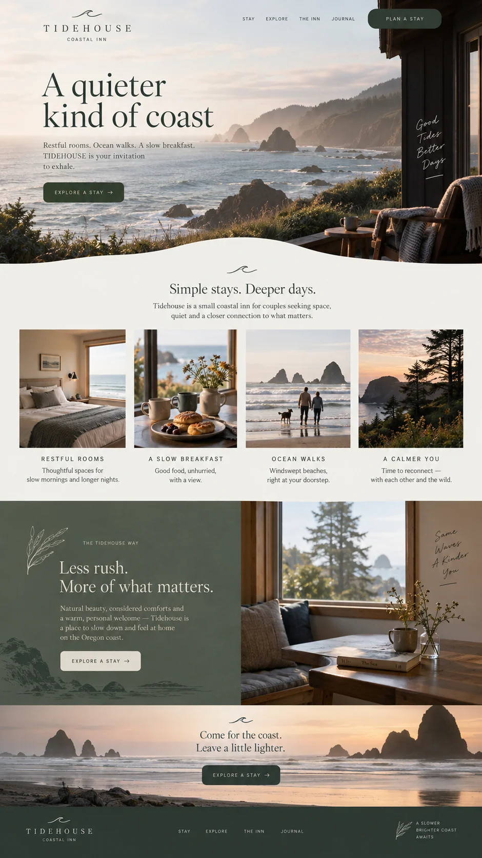
Tidehouse opens with a coastal view and a quiet invitation to explore a stay. The next row shows what a stay includes: a room, breakfast, a walk, and the surrounding landscape. The design keeps a narrow palette and generous spacing, which suits the brief without asking every sentence to describe relaxation.
A booking page would need more than the promise of a peaceful weekend. Dates, room options, location, rates, cancellation terms, and a reliable booking destination would determine whether someone can act. We would add that information at the point where interest becomes planning. Borrow the connection between setting and experience; avoid borrowing a vague promise that could describe any property.
Morrow Studio: show what the conversation will be about
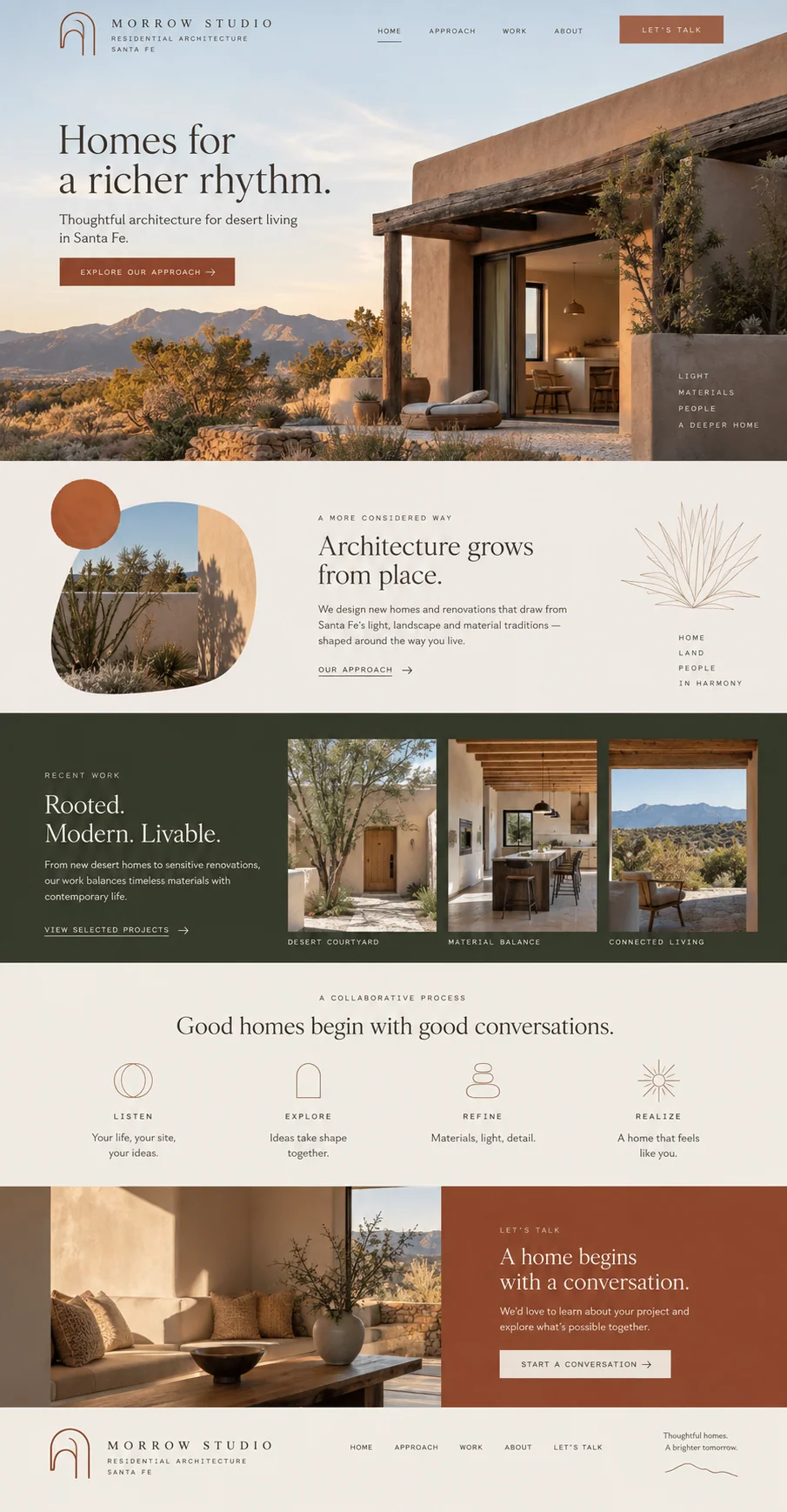
Morrow Studio centers on residential architecture in Santa Fe. Desert homes, warm materials, and the project row make its point of view visible. A four-part process then gives a prospective client a rough sense of how the relationship might unfold. The final invitation to start a conversation fits a service that requires discussion before a quote.
For an actual practice, project imagery needs clear authorship and permission. Completed work, proposals, and illustrative concepts should be labeled accurately. We would also clarify the work the practice accepts and the information useful for a first inquiry. For this kind of project, an inquiry should begin a discussion about the work, budget, and site.
Apply the ideas to your own page
Compare examples against the questions your visitors bring. Keep the visual decisions that help answer them and discard those that only imitate the surface. Then inspect the working page: keyboard navigation, readable text, descriptive image alternatives, and labeled controls matter as much as the composition. W3C’s development guidance is a useful starting point for that review.
Before launch, ask someone unfamiliar with the offer to describe it back to you and follow the intended action. Record where they hesitate. After launch, look at qualified inquiries or completed purchases alongside failures and abandoned steps. A design critique can suggest what to try; observed behavior is what lets you judge the result.
Source: W3C Web Accessibility Initiative: Developing for web accessibility
Sources and further reading
- Landing pageGoogle Ads Help
- Developing for web accessibilityW3C Web Accessibility Initiative