Ecommerce landing page examples: candy and commuter bags
Compare two product page designs to see how photography, product options, and specifications help shoppers choose.
Different products create different questions
An ecommerce landing page needs to make the product desirable and understandable. Those jobs are related, but they are not identical. Candy can create interest through flavor and texture. A commuter bag also needs to answer practical questions about what fits, how it carries, and which version suits the buyer.
The Pepple and Foldwave designs were created with Waveform for two different briefs. We use them to examine how product information is arranged. Compare the questions each product raises: a snack can prompt a quick purchase, while a bag may require measurements and a closer look at construction.
Pepple: show the flavors
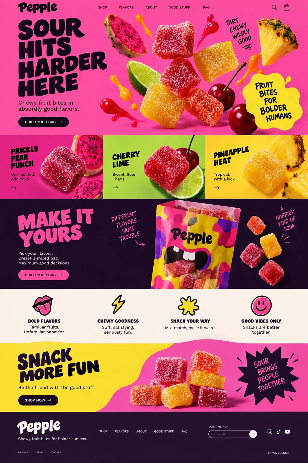
Pepple puts candy and fruit close to the opening message, then separates the range into three flavor tiles. The bright palette and large product details suit an energetic snack brand. The mixed-bag section connects the separate flavors to a single action, so the page has a reason to repeat its bag-building invitation.
This is more informative than a large mood photograph with no product explanation. A buyer can infer the type of snack and see the intended range. The next draft for a real business should make pack size, price, ingredients, allergens, and delivery information easy to reach. If customization is offered, the page needs to explain its limits: how many flavors, what quantities, and what changes the price.
Foldwave: show how the bags are used and made
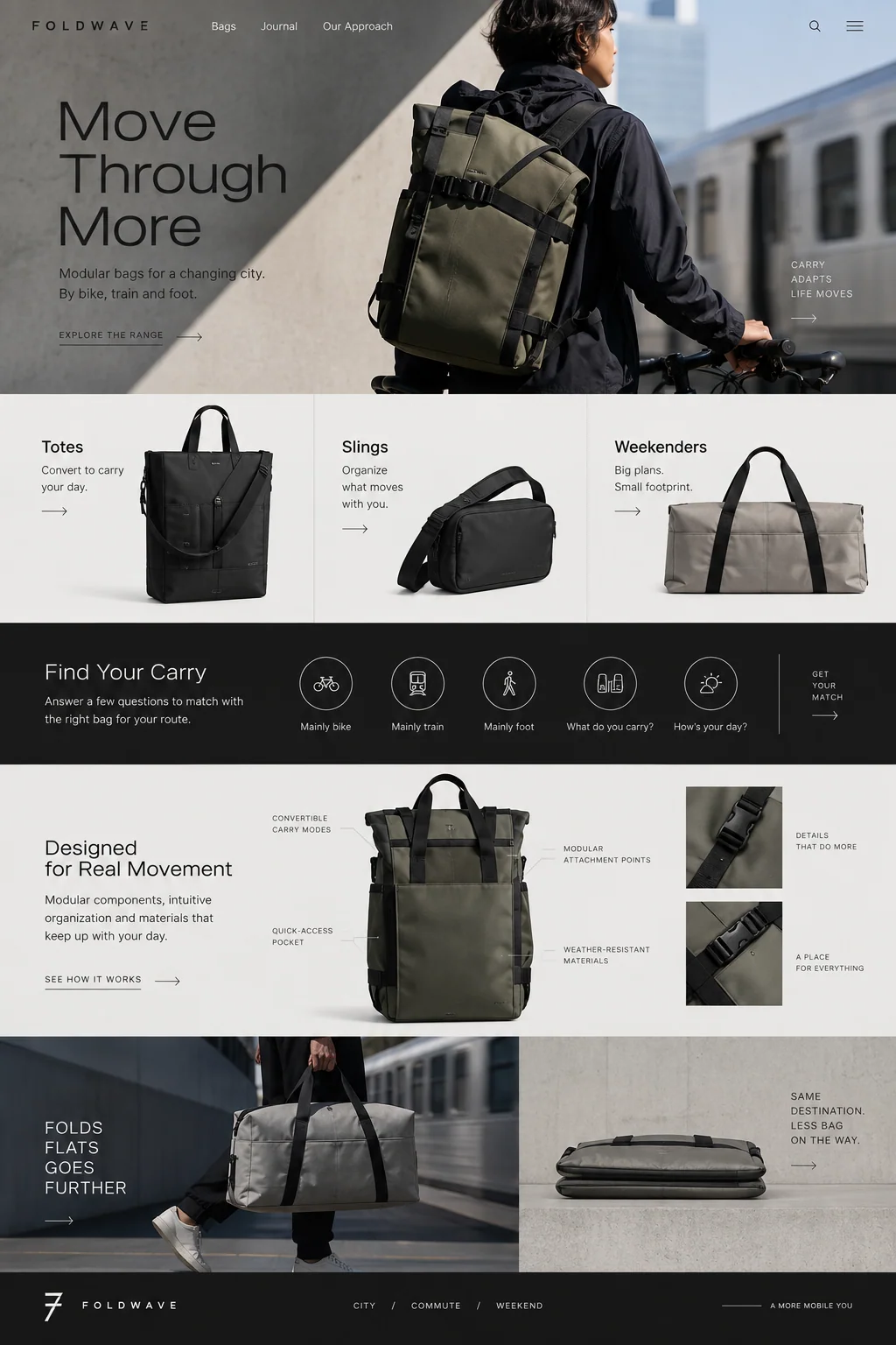
Foldwave begins with a bag worn beside a bicycle. It follows with totes, slings, and weekenders, then shows a carry-selection concept and close details of straps and attachments. The subdued setting lets differences in product form carry more weight than bright decoration. A later panel shows a bag folded flat, which suggests a practical use for the material and construction story.
A real product page should turn those suggestions into verifiable specifications. Show dimensions, weight, capacity, compatible device sizes, and how straps adjust. If weather resistance is claimed, use the manufacturer’s actual wording and explain the relevant limitations. If you include a product selector, connect each choice to the matching item in your store.
Decide whether you are selling a range or a particular item
Both concepts show a range. That is useful when visitors need to discover what exists, but a specific product campaign needs a more direct path. Someone following an ad for a certain color and size should not have to start the selection again without explanation. Bring the advertised item and its availability into the first useful section.
For a category page, prioritize differences that help people choose. For a product page, prioritize the selected item, its variants, the purchase terms, and any details needed to judge fit. For a bundle, explain exactly what the bundle contains. Do not assume the visitor understands a brand’s internal product names or knows how a subscription differs from a one-time order.
Make purchase terms easy to find
Keep the final price and selected variant visible near the purchase action. Put the other purchase terms in short sections or behind descriptive links, where people can read them before committing. This leaves room for product imagery while giving buyers the information they need.
For an actual shop, product structured data may help Google understand price, availability, and other product details for supported search appearances. Follow the requirements for the type of page you operate and keep that data consistent with the visible offer.
- Product: size, materials or ingredients, contents, and relevant care or use information.
- Offer: price, currency, purchase type, availability, and variant selection.
- Fulfillment: shipping destination, realistic delivery information, and return terms.
- Support: a working route to ask a question when the page cannot answer it.
Source: Google Search Central: Introduction to product structured data
Test the checkout, delivery, and returns information
Try product selection with a keyboard and check that variant names and form controls have useful labels. Describe informative product imagery with text alternatives that communicate what matters. W3C’s accessibility guidance covers these basics. Check swatches and image selectors closely: their appearance may be the only place a color or variant is identified.
Then follow a test purchase through the real checkout setup. Verify the selected item, quantity, currency, shipping destination, and confirmation. Try an unavailable variant and a failed payment using the provider’s test facilities. Fix any mismatch between the page and checkout before launch. The offer shown, the item selected, and the item ordered need to agree.
Source: W3C Web Accessibility Initiative: Developing for web accessibility
Sources and further reading
- Introduction to product structured dataGoogle Search Central
- Developing for web accessibilityW3C Web Accessibility Initiative