How to write a waitlist landing page
Write a waitlist brief, explain what joining means, and check your signup form before sharing the page.
Give people a reason to hear from you
A waitlist landing page explains an upcoming offer and lets people request a future update. It works best when the reader understands who the product is for, what problem it addresses and what joining means. An email field on its own cannot answer those questions.
Start with the decision you need to make. You might want to learn whether studio owners want to see a scheduling tool, or invite a small group to try a new workshop. Those are different commitments. Name the invitation accurately: an update, a research conversation, an application or access to a working product. Do not imply immediate access when the product is not available.
Write the invitation before you write the headline
Consider this example brief: “We are exploring a tool for independent pottery studios to organize workshop inquiries. The first version is still being developed. Create a page inviting studio owners to hear when a trial is ready. Use our calendar prototype to show how it will work, and make joining the launch list the main action.”
That brief identifies the audience, the product’s current stage, and what visitors are signing up for. Add the actual contact destination and the information you plan to send. If the business cannot yet explain the next communication, settle that decision before asking visitors to subscribe.
- Audience: the specific person who would use the offer.
- Current state: what exists, what is proposed and what can be demonstrated.
- Invitation: what the visitor will receive by leaving their details.
- Follow-up: who owns the request and what happens next.
Show what you have built so far
Useful early proof can be modest: a clear explanation of the problem, a prototype labeled as a prototype, or a real account of work you have already done. A concept illustration can help a visitor picture the idea, but it should not be passed off as a screenshot of a functioning product.
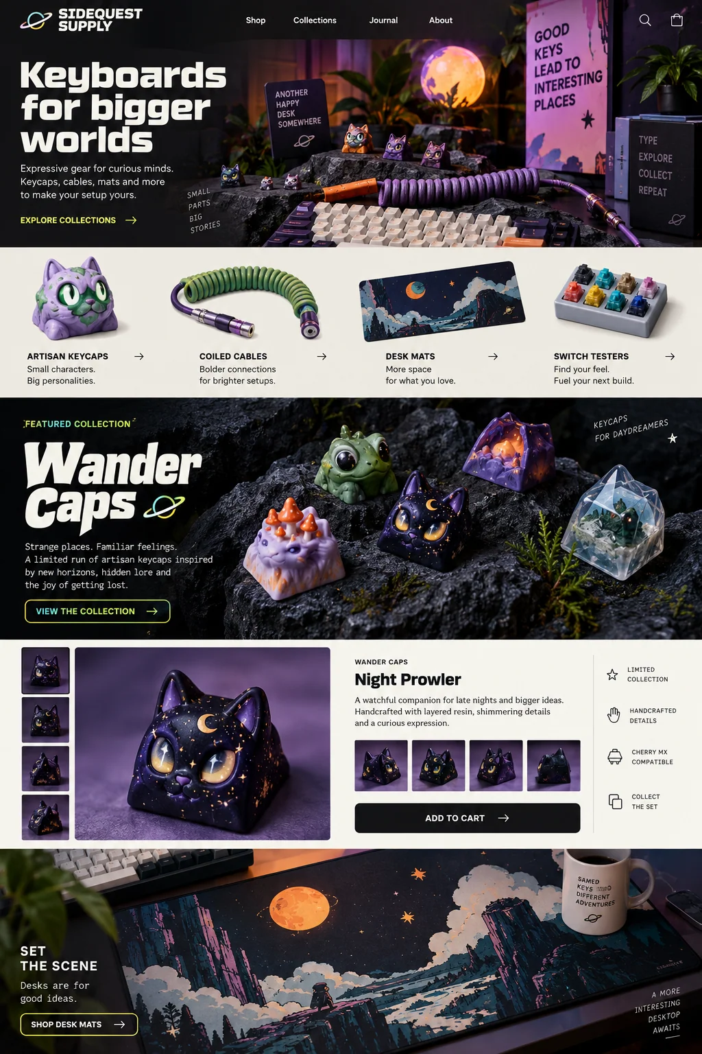
The Sidequest Supply concept in our gallery illustrates a product-focused design direction. Use it to consider where an explanation and an action belong. For your own page, keep proposed interfaces distinct from available features and avoid invented counters, logos and quotations.
Ask for information you will actually use
An email address may be sufficient for a launch notification. An invitation to a research conversation might need one additional question about the visitor’s work. Explain why a question matters and make optional fields visibly optional. Collecting more information is not automatically better qualification.
Use a visible label for every control and a button that describes the action. W3C’s forms guidance explains the value of labels, instructions and understandable validation. Review the form with a keyboard and at a narrow phone width. Check whether a person can identify the field, correct an error and understand the next step without relying only on color.
Make the confirmation match what actually happened
A success message should tell the visitor what was received and what happens next. If the page only saved an inquiry, it should not say that a confirmation email was delivered. W3C’s notification guidance recommends clear feedback about successful completion and errors.
Waveform managed forms depend on their configured hosted endpoint. Receiving a submission and delivering it to another service are separate events. A waitlist also needs an actual owner and a follow-up process. Do not assume a page builder supplies an email campaign system, referral rewards or an ordered queue unless those services have been selected and connected.
Sources: W3C Web Accessibility Initiative: User notifications; Waveform: Forms and submissions
Review the full invitation before sharing it
Read the page as someone who has never heard of the product. Can they explain what it does, whether it is available and why they might want an update? Follow the form from an empty submission through an intentional error to a clearly marked test. Verify that the receiving person can find the test and knows how to handle it.
Choose a small, relevant distribution channel and record what you shared, when, and who the audience was. A signup is evidence of the specific commitment described on the page; it is not a sale or proof of willingness to pay. If interest is weak, investigate the audience, offer and invitation before assuming the layout needs to change.
In Waveform, start with your completed brief, review the design and working page, then publish the selected version deliberately. Use the headline, form-design and brief guides below to work through the parts that still need a decision.
Sources and further reading
- Forms tutorialW3C Web Accessibility Initiative
- User notificationsW3C Web Accessibility Initiative
- Forms and submissionsWaveform